Accessibility guidelines for visual design
In providing inclusive experiences to all Tweeps, it's important that the programs and courses my team creates are accessible. While there were various accessibility resources available to us at Twitter, my team needed a guide specifically tailored to the work that we do in visual and learning design.
Referencing the existing accessibility documents and conducting my own research, I created one, centralized guide on accessible design. It covers best practices around color, text, images, navigation landmarks, captions, tables/charts/graphs, and animations/transitions. The guide was tested and approved by Twitter's accessibility team and a third-party vendor.
Tools: Google Slides
Here are a few sample slides:

Color contrast guidelines.
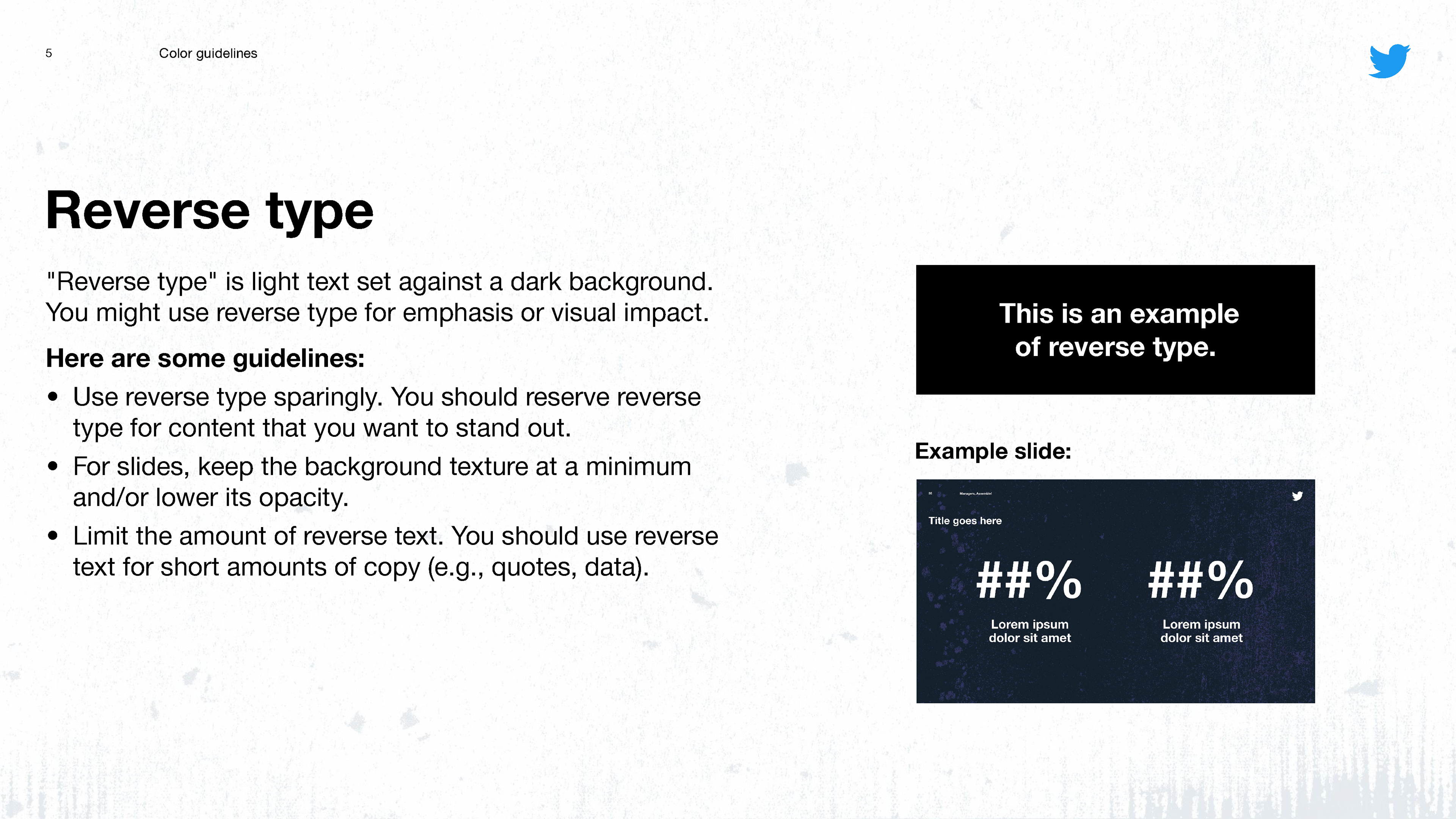
Limiting reverse type.
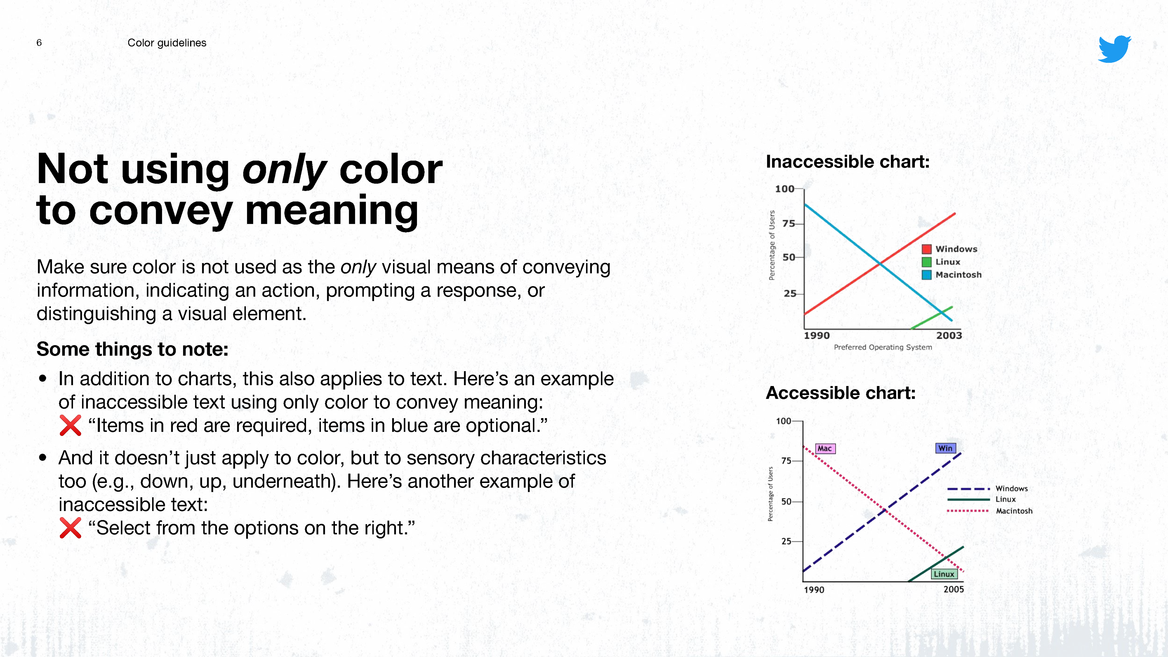
Not using only color to convey meaning guidelines.
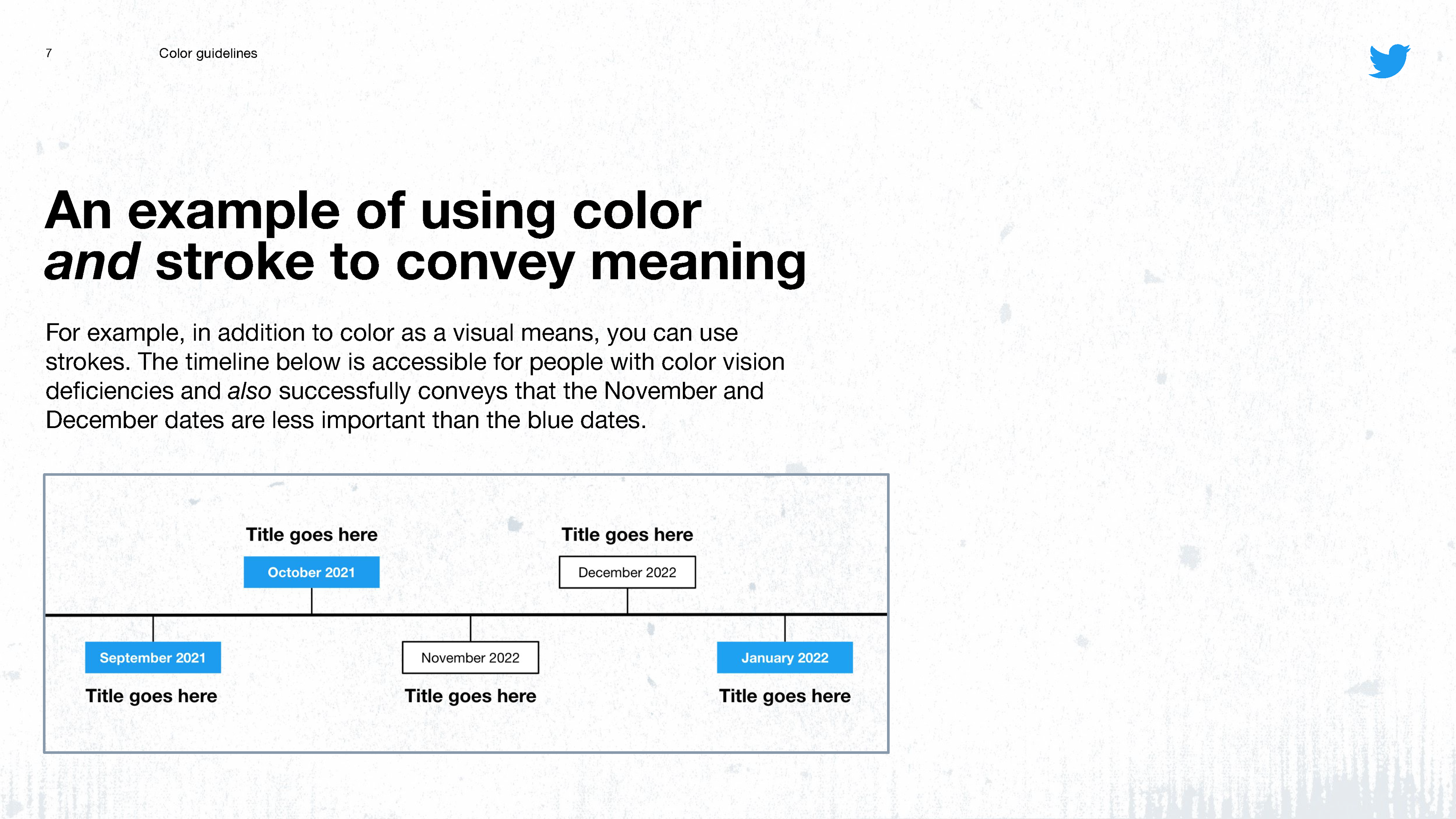
An example on how to use color and stroke to convey meaning.
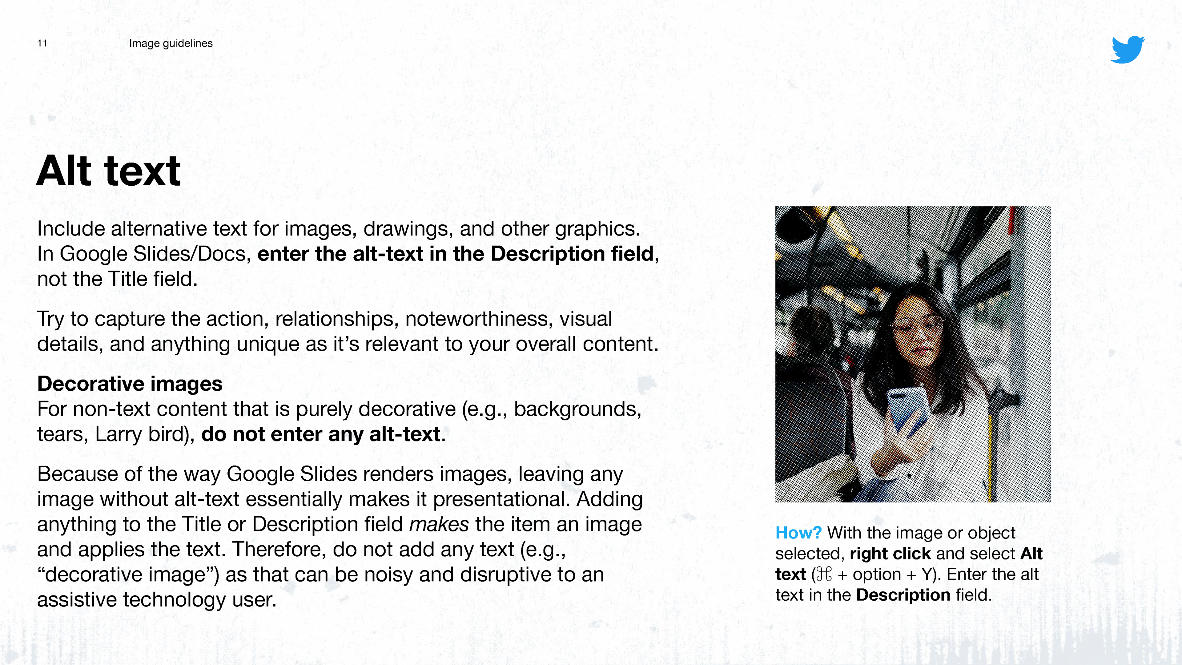
Overview on alt text.
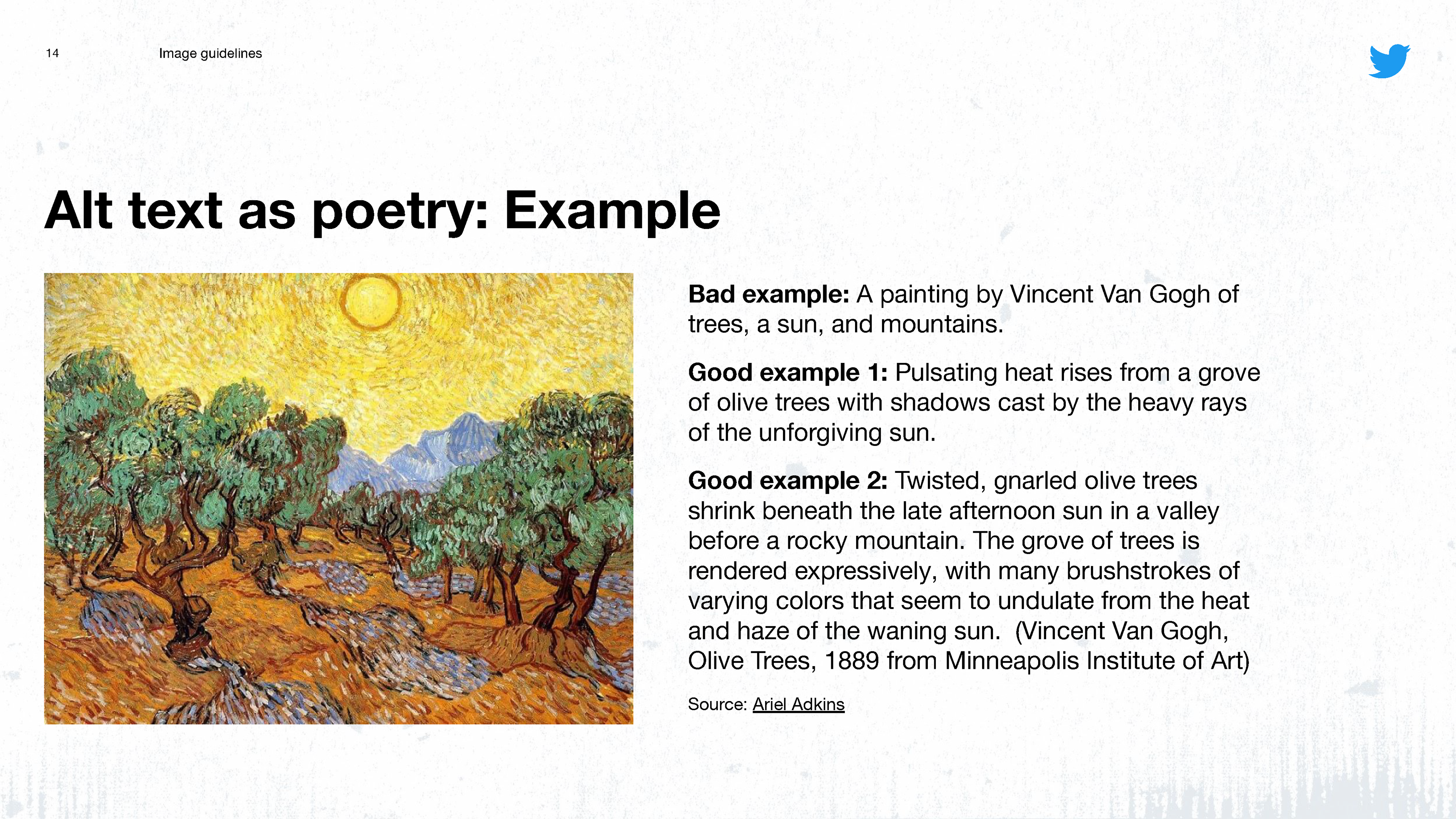
Writing alt text as poetry.
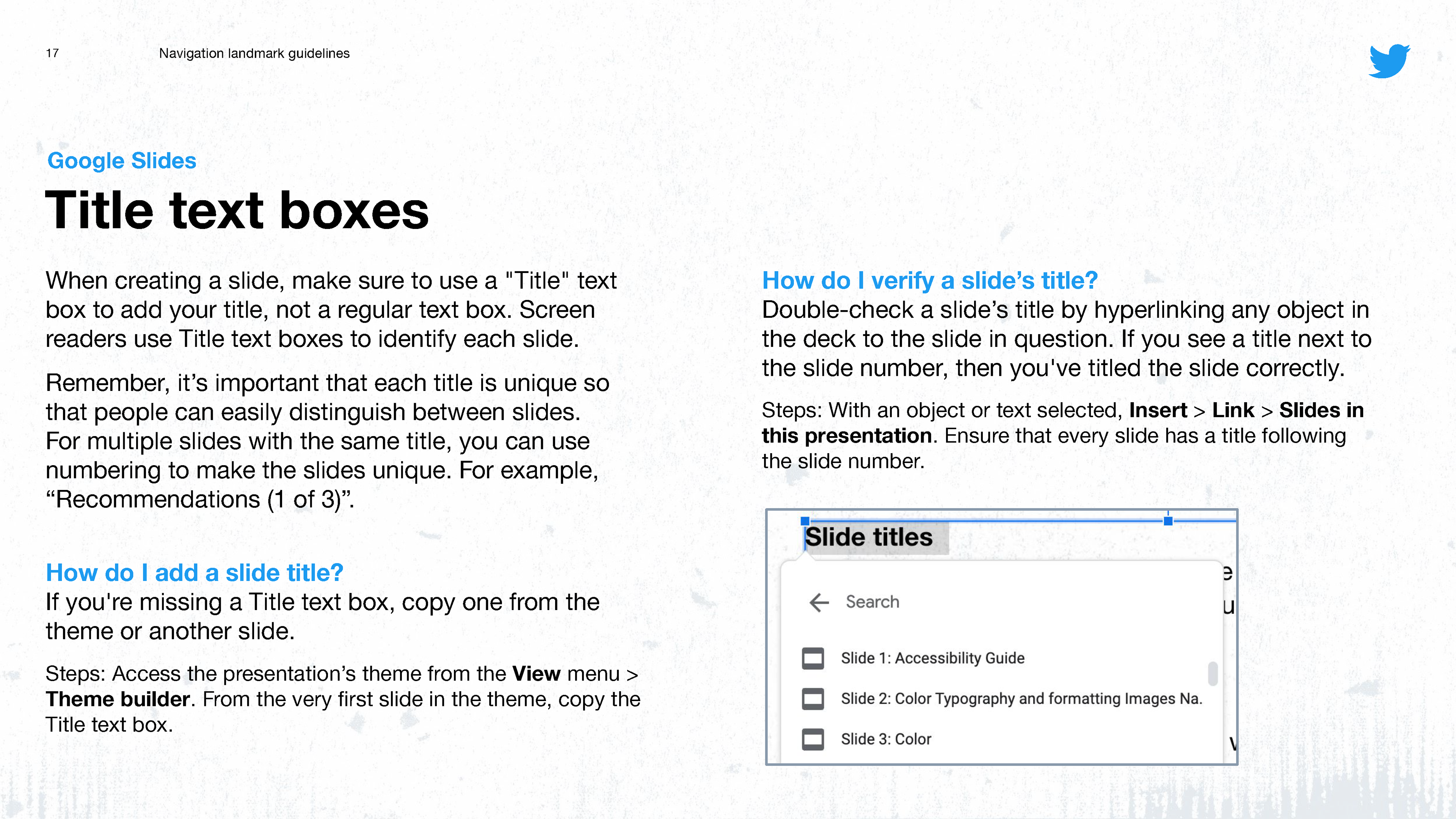
The importance of using Title text boxes in Google Slides.
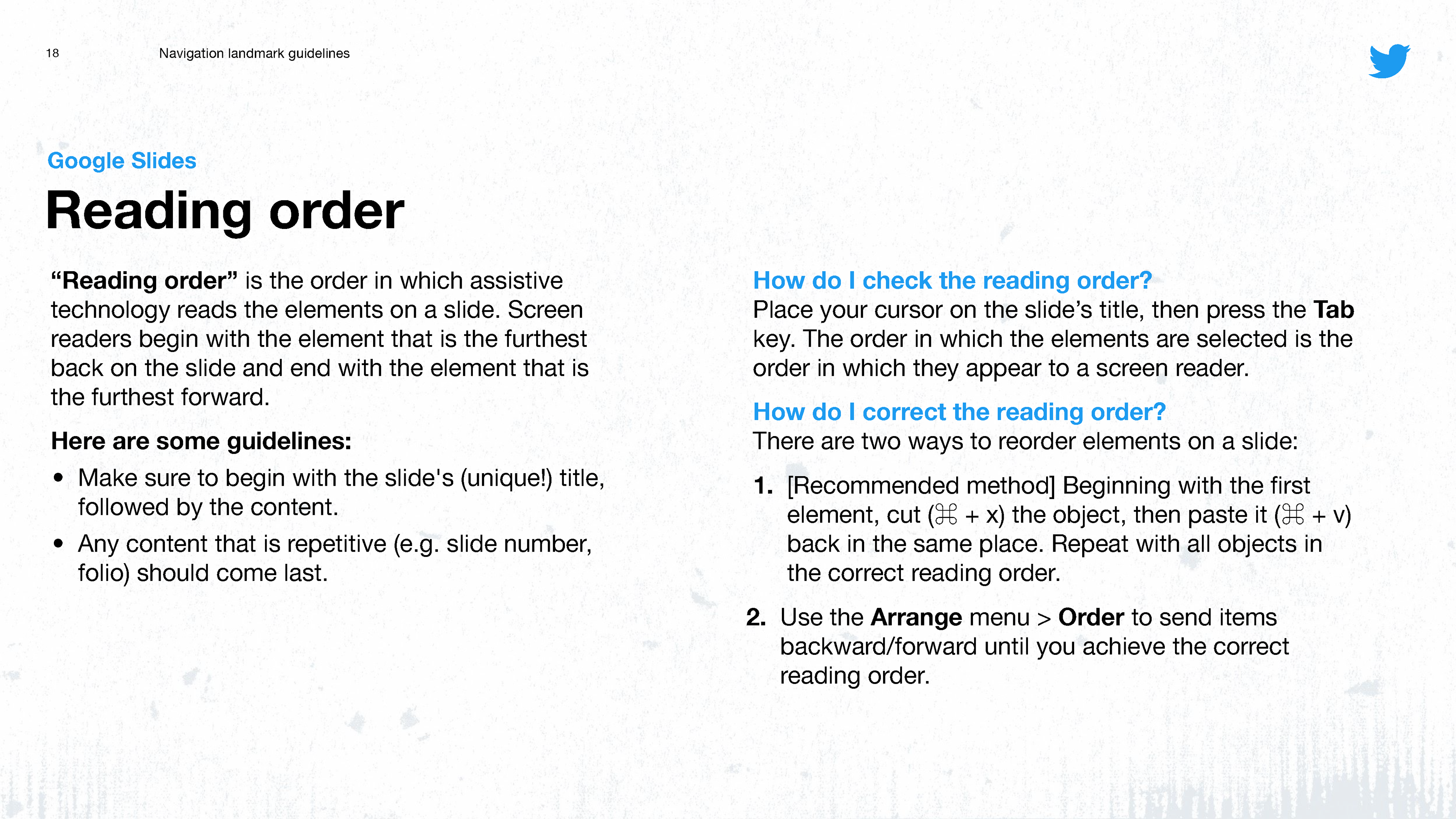
How to adjust reading order.
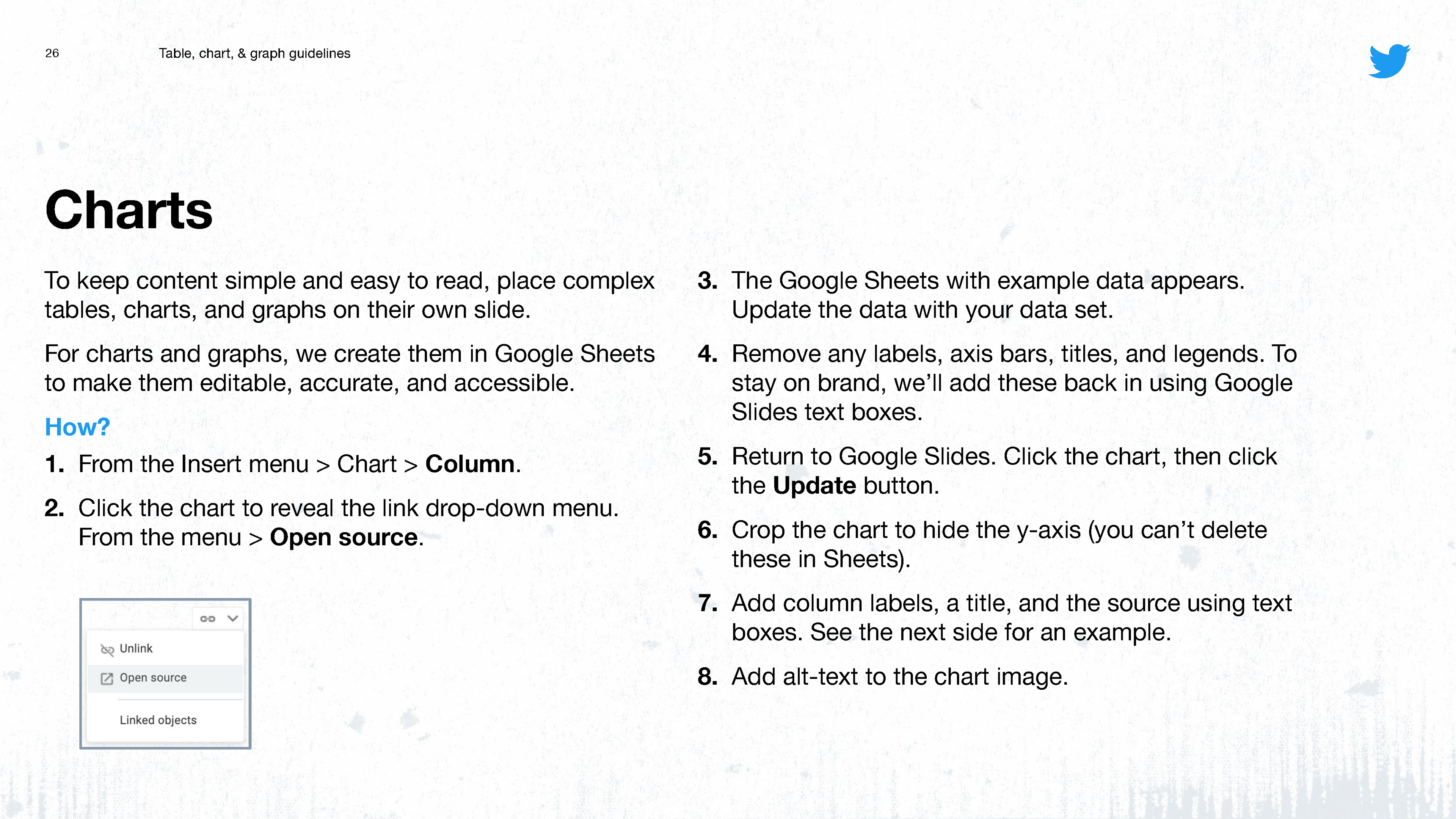
How to create accessible charts in Google Slides/Sheets.
